[AITech] 20220204 - Matplotlib Text API
학습 내용
Text API in Matplotlib
시각화에 텍스트가 필요한 이유는 무엇일까?? 시각화란 그림으로 표현하는 것이 아닌가??
시각화에서 텍스트는 중요한 역할로 사용될 수 있습니다. 예를 들면, 그림으로는 전달할 수 없는 정보를 전달하거나, 정확한 정보를 전달해 오해를 방지할 수 있습니다. 하지만 텍스트 또한 다른 것들과 마찬가지로 과하게 사용한다면 이해를 방해할 수 있으므로 적절히 사용하는 것이 가장 중요합니다.
그렇다면 그래프에서 텍스트 요소는 무엇이 있을까요?

- Title: 가장 큰 주제를 설명
- Label: 축에 해당하는 데이터를 제공(축의 값이 무엇을 나타내는지)
- Tick Label: 축에 눈금을 사용하여 스케일 정보 전달
- Legend: 하나의 서브플롯에서 2개 이상의 그래프를 구분하기 위해 사용하는 보조 정보(범례)
- Annotation(Text): 그 외의 시각화에 대한 설명을 추가
위 요소들을 사용한 예제를 한 번 볼까요?
fig, ax = plt.subplots()

fig.suptitle('Figure Title') # figure 타이틀

ax.plot([1, 3, 2], label='legend')
ax.legend() # 서브플롯 범례

ax.set_title('Ax Title') # 서브플롯 타이틀
ax.set_xlabel('X Label') # 서브플롯 x축 정보
ax.set_ylabel('Y Label') # 서브플롯 y축 정보

ax.text(x=1,y=2, s='Text') # 서브플롯을 기준으로 텍스트 기입
fig.text(0.5, 0.6, s='Figure Text') # figure를 기준으로 텍스트 기입

plt.show()

그러면, 이제 Matplotlib에서의 Text API에 대해 자세히 알아보시죠!
Text Properties
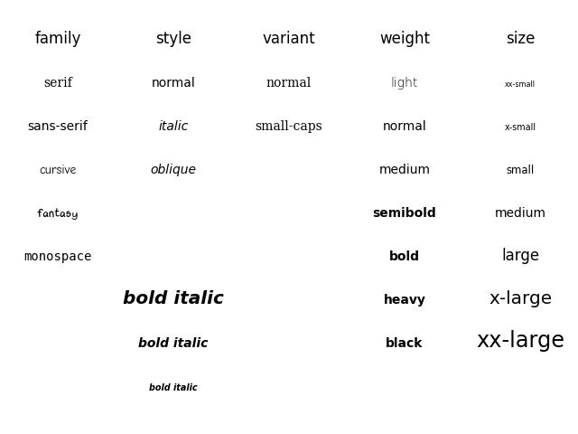
Font
대표적인 Font 요소에는 다음의 것들이 있습니다.
familyorfontfamily: 글씨체sizeorfontsize: 글씨 크기styleorfontstyle: 글씨 스타일(볼드체, 이탤릭체 등)weightorfontweight: 글씨 굵기
글씨체에 따른 가독성 관련하여는 다음 내용을 참고하면 좋습니다.
- Material Design : Understanding typography
- StackExchange : Is there any research with respect to how font-weight affects readability?
아래는 Fonts Demo입니다.
fig, ax = plt.subplots()
ax.set_xlim(0, 1)
ax.set_ylim(0, 1)

ax.text(x=0.5, y=0.5, s='Text\nis Important',
        fontsize=20,
        fontweight='bold',
        fontfamily='serif'
       )

plt.show()

Details
폰트 자체와는 조금 다르지만 커스텀할 수 있는 요소들입니다.
color: 글씨 색linespacing: 글씨 행간 너비backgroundcolor: 배경색alpha: 투명도zorder: 화면 상에서 우선순위(맨앞으로 가져오기, 맨뒤로 가져오기 등의 우선순위)visible: 보이게 하거나, 보이지 않게 하거나
fig, ax = plt.subplots()
ax.set_xlim(0, 1)
ax.set_ylim(0, 1)

ax.text(x=0.5, y=0.5, s='Text\nis Important',
        fontsize=20,
        fontweight='bold',
        fontfamily='serif',
        color='royalblue',
        linespacing=2,
        backgroundcolor='lightgray',
        alpha=0.5
       )

plt.show()

Alignment
정렬과 관련하여서는 다음의 요소들을 조정할 수 있습니다.
ha: horizontal alignmentva: vertical alignmentrotation: 회전(‘vertical’ 등으로 전달하거나 45, 90 등의 degree로 전달)multialignment
fig, ax = plt.subplots()
ax.set_xlim(0, 1)
ax.set_ylim(0, 1)

ax.text(x=0.5, y=0.5, s='Text\nis Important',
        fontsize=20,
        fontweight='bold',
        fontfamily='serif',
        color='royalblue',
        linespacing=2,
        va='center', # top, bottom, center
        ha='center', # left, right, center
        rotation=45 # horizontal? vertical?
       )


plt.show()

Advanced
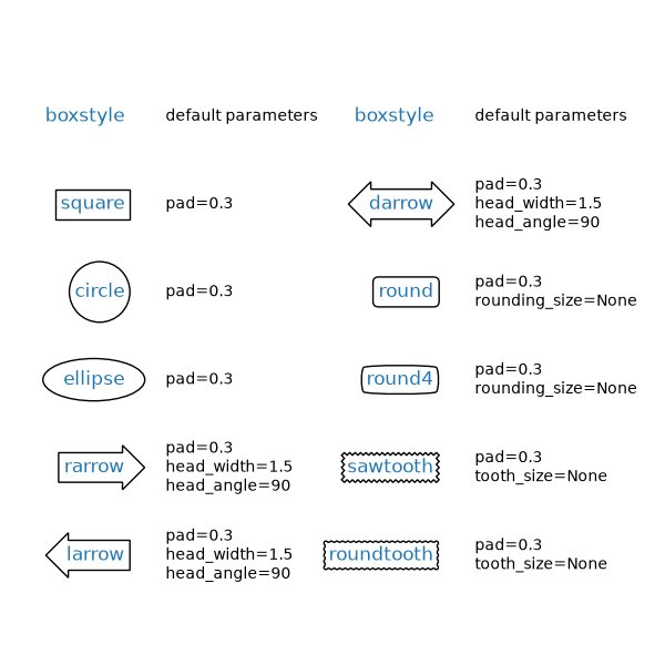
마지막으로 텍스트에서 사용할 수 있는 bbox에 대해 소개하겠습니다. (Drawing fancy boxes)
fig, ax = plt.subplots()
ax.set_xlim(0, 1)
ax.set_ylim(0, 1)

ax.text(x=0.5, y=0.5, s='Text\nis Important',
        fontsize=20,
        fontweight='bold',
        fontfamily='serif',
        color='black',
        linespacing=2,
        va='center',
        ha='center',
        rotation='horizontal',
        bbox=dict(boxstyle='round', facecolor='wheat', alpha=0.4) # dict 형태로 bbox 인자 전달
       )

plt.show()

bbox의 경우 다양하게 활용할 수 있고, 그만큼 많은 내용들이 있기 때문에 더 많은 내용은 더 찾아보시는 것을 추천드립니다.
다양한 활용 사례
여기서는 그래프에 텍스트를 활용한 몇 개의 사례를 보도록 하겠습니다.
제목과 범례 설정하기
.set_xlabel(), .set_ylabel(), .set_title(), .legend() 등도 인자를 전달하여 다양하게 설정 가능합니다.
전달하고자 하는 정보를 잘 부각시킬 수 있는 위치로 설정해봅시다.
fig = plt.figure(figsize=(9, 9))
ax = fig.add_subplot(111, aspect=1)

for g, c in zip(['male', 'female'], ['royalblue', 'tomato']):
    student_sub = student[student['gender']==g]
    ax.scatter(x=student_sub ['math score'], y=student_sub ['reading score'],
               c=c,
               alpha=0.5,
               label=g)

ax.set_xlim(-3, 102)
ax.set_ylim(-3, 102)

ax.spines['top'].set_visible(False)
ax.spines['right'].set_visible(False)
# 제목도 다양하게 설정 가능
ax.set_xlabel('Math Score',
              fontweight='semibold')
ax.set_ylabel('Reading Score',
              fontweight='semibold')

ax.set_title('Score Relation',
             loc='left', va='bottom',
             fontweight='bold', fontsize=15
            )

ax.legend( # 범례 또한 다양하게 설정 가능!
    title='Gender',
    shadow=True,
    labelspacing=1.2,
    loc='lower right',
    bbox_to_anchor=[1.2, 0.5]
)

plt.show()

범위/수치로 나타내기
bar plot에 x축의 눈금은 범위로 나타내고, y축은 없애는 대신 정확한 수치를 표기하면 가독성이 높아질 것입니다.
# x축 인덱스 재설정
def score_band(x):
    tmp = (x+9)//10
    if tmp <= 1:
        return '0 - 10'
    return f'{tmp*10-9} - {tmp*10}'

student['math-range'] = student['math score'].apply(score_band)

# bar plot
math_grade = student['math-range'].value_counts().sort_index()

fig, ax = plt.subplots(1, 1, figsize=(11, 7))
ax.bar(math_grade.index, math_grade,
       width=0.65,
       color='royalblue',
       linewidth=1,
       edgecolor='black'
      )

ax.margins(0.01, 0.1)
ax.set(frame_on=False)
ax.set_yticks([])
ax.set_xticks(np.arange(len(math_grade)))
ax.set_xticklabels(math_grade.index)

ax.set_title('Math Score Distribution', fontsize=14, fontweight='semibold')

for idx, val in math_grade.iteritems():
    ax.text(x=idx, y=val+3, s=val,
            va='bottom', ha='center',
            fontsize=11, fontweight='semibold'
           )

plt.show()

데이터 강조하기
특정 데이터를 강조하면 사용자에게 훨씬 쉽게 다가갈 수 있을 것입니다.
fig = plt.figure(figsize=(9, 9))
ax = fig.add_subplot(111, aspect=1)
# 강조하고자 하는 데이터 순서
i = 13
# Scatter plot
ax.scatter(x=student['math score'], y=student['reading score'],
           c='lightgray',
           alpha=0.9, zorder=5)

ax.scatter(x=student['math score'][i], y=student['reading score'][i],
           c='tomato',
           alpha=1, zorder=10)
# 서브플롯 설정
ax.set_xlim(-3, 102)
ax.set_ylim(-3, 102)

ax.spines['top'].set_visible(False)
ax.spines['right'].set_visible(False)

ax.set_xlabel('Math Score')
ax.set_ylabel('Reading Score')

ax.set_title('Score Relation')

# x축과 평행한 선
ax.plot([-3, student['math score'][i]], [student['reading score'][i]]*2,
        color='gray', linestyle='--',
        zorder=8)

# y축과 평행한 선
ax.plot([student['math score'][i]]*2, [-3, student['reading score'][i]],
       color='gray', linestyle='--',
       zorder=8)
# 텍스트 표기(annotate)
bbox = dict(boxstyle="round", fc='wheat', pad=0.2)
arrowprops = dict(
    arrowstyle="->")

ax.annotate(text=f'This is #{i} Studnet',
            xy=(student['math score'][i], student['reading score'][i]),
            xytext=[80, 40],
            bbox=bbox,
            arrowprops=arrowprops,
            zorder=9
           )

plt.show()

참고 자료
- Text Properties - Font
- Text Properties - Advanced
Leave a comment